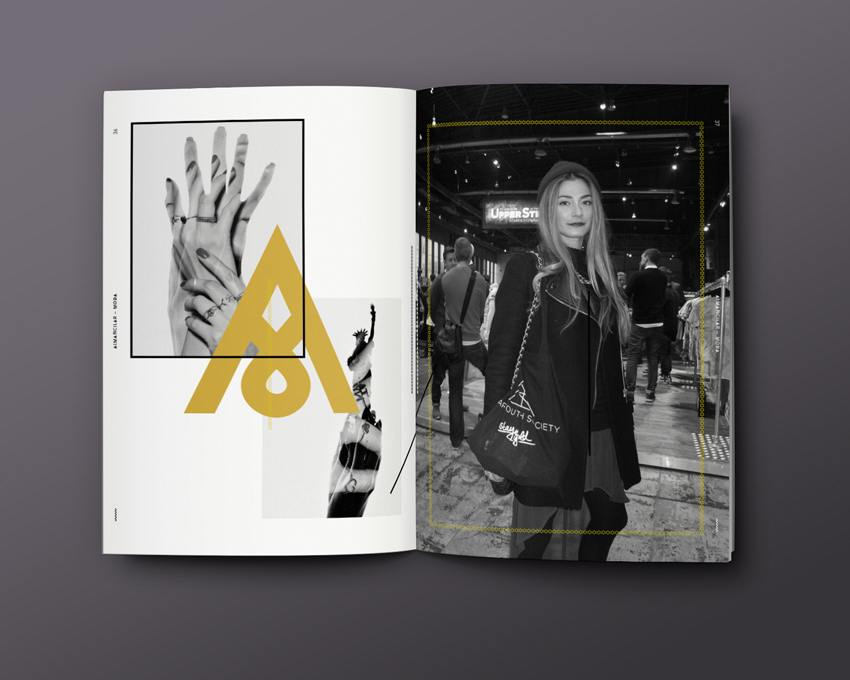
Today we’d like to introduce you to the „Almancilar Magazine“. The magazine was designed and initiated by communication designer Burak Yilmaz Kececile (25), for his thesis at the Institute Of Design in Dusseldorf.
How did you get the idea to start the „Almanci Mag“ for your thesis?
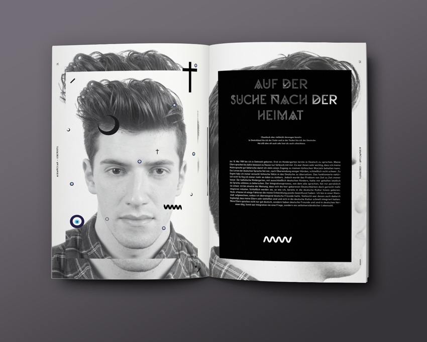
First of all, in my previous work it has always been important to me to deal with a relevant topic. Since I consider myself an „Almancılar“ (engl. a slightly derogatory term used by Turks living in Turkey to refer to Turks who grew up in Germany – ed.), I had the idea of creating a magazine about the merger and complexity of the two cultures. I wanted these aspects to be reflected in both design and content. I was interested in assessing the possible need for such a magazine – especially since there was nothing like that available at the time.
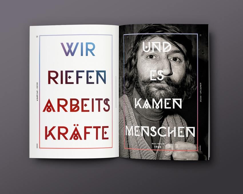
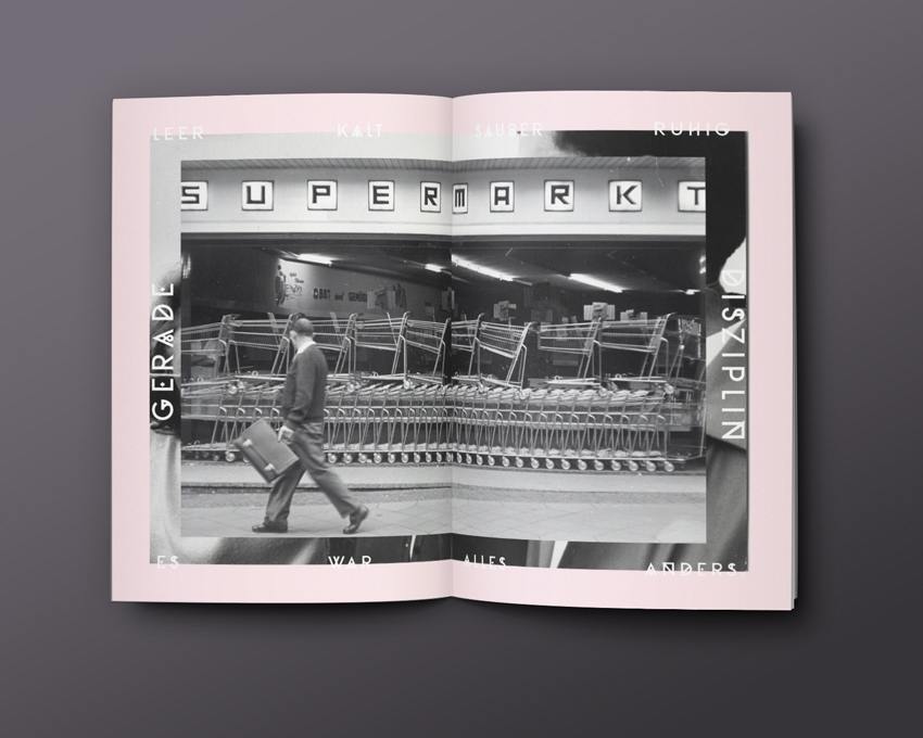
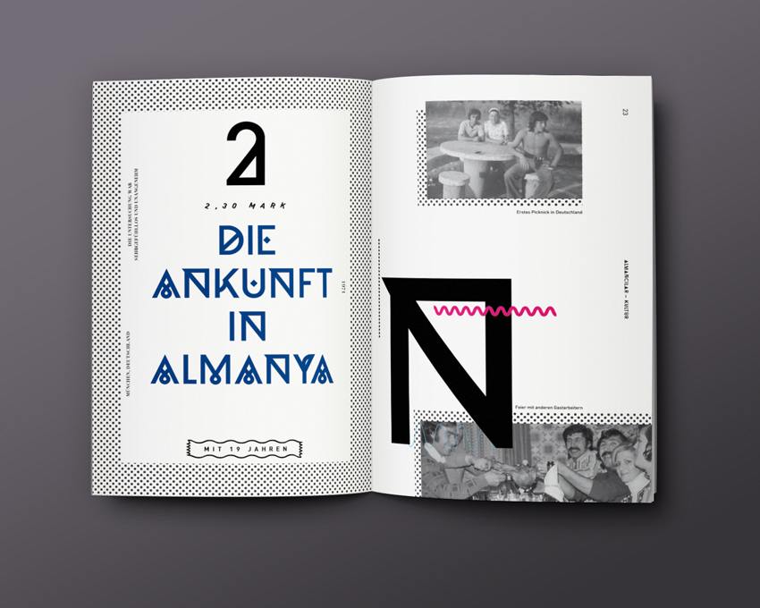
Do you think people with Turkish roots do things differently?
Yes, people of Turkish origin, who grew up in Germany, are influenced by both cultures and at various levels. Of course the artistic influences are very important, but things like bilingualism and intercultural competence also play a role, too. All in all, people with a migration background receive not only a greater, but also a more diverse input.
Why do you divide the magazine into four different parts – e.g. lifestyle, fashion, media and culture?
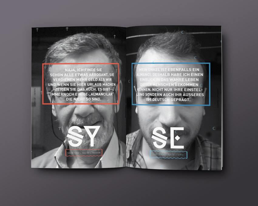
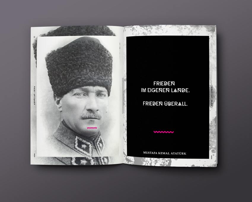
The division into four individual magazines is designed to visually illustrate the existing complexity. The magazines can all stand alone, but they are intended to be viewed as a whole, to create an overall picture of the „Almancılar“. So, I wanted to sketch different characters of the „Almancılar“, characterized by a wide variety of facets and cultural influences, but all in harmony together. The division into four magazines: Lifestyle, fashion, media and culture was made because these are issues and areas of life that interest the „Almancılar“. As part of that group, I also included my own personal interests.
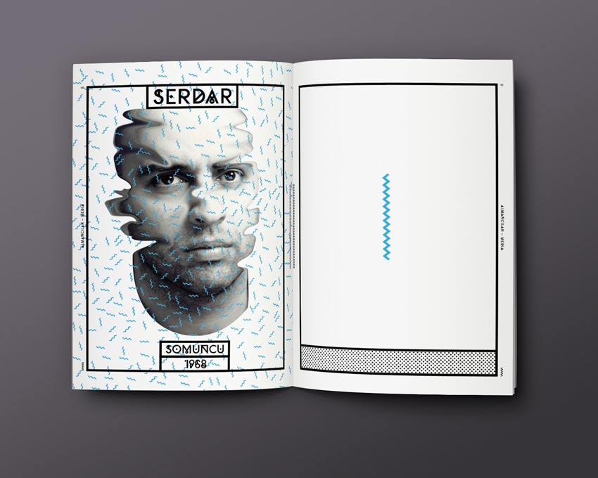
Is there a reason why there are so many advertisements in your magazine?
My lecturer defined the amount of advertising space the magazine would have. This was to give the magazine an authentic look. My lecturer was very concerned about professional appearance; it’s thanks to him that I paid such close attention to so many details
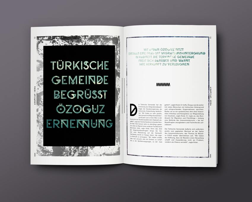
Why did you choose an ornate script font for the header? And why are there so many other decorative elements?
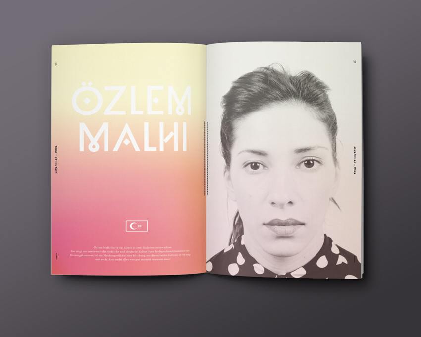
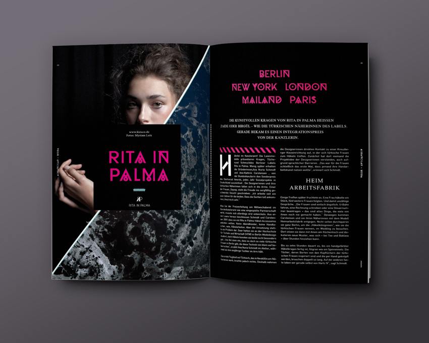
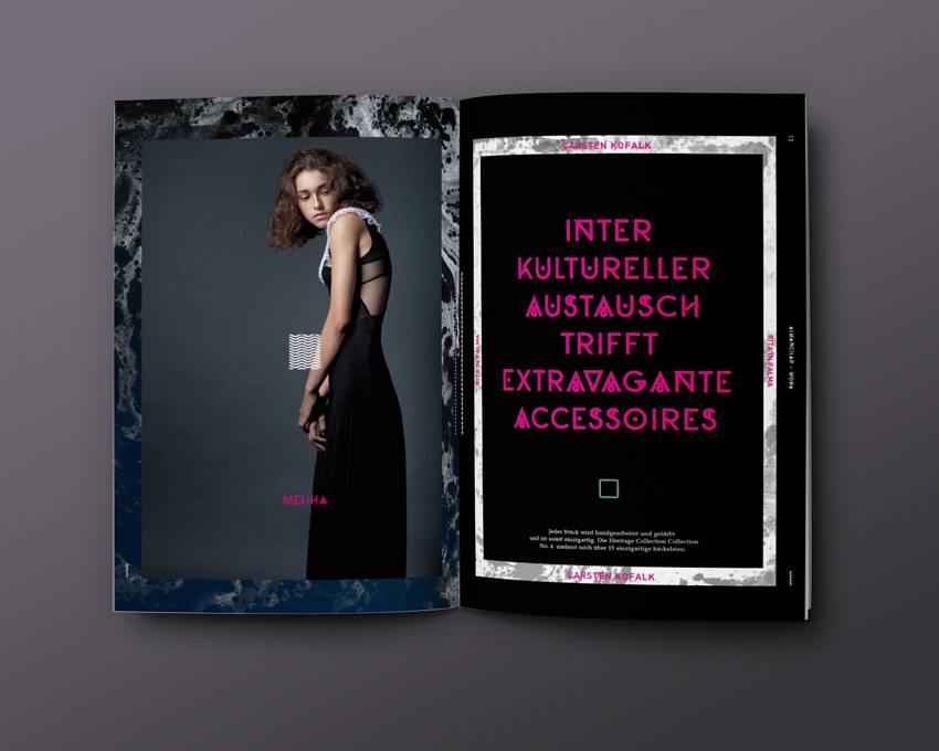
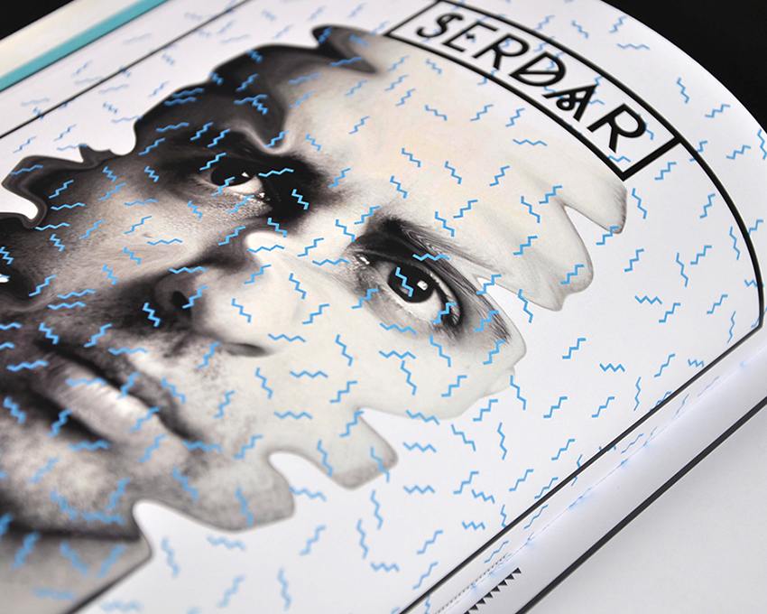
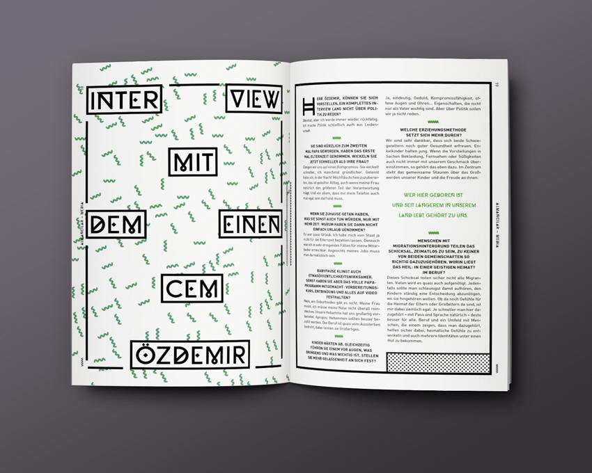
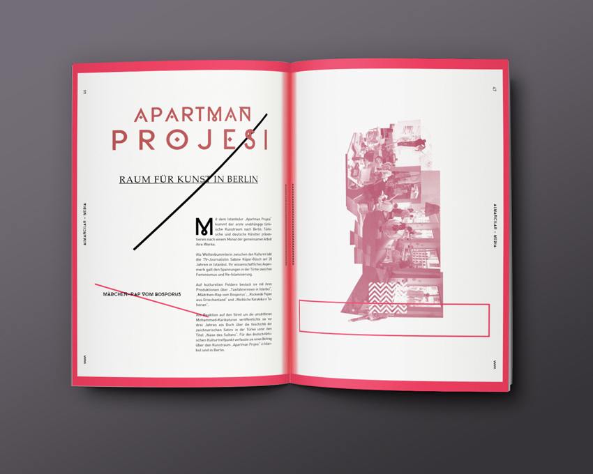
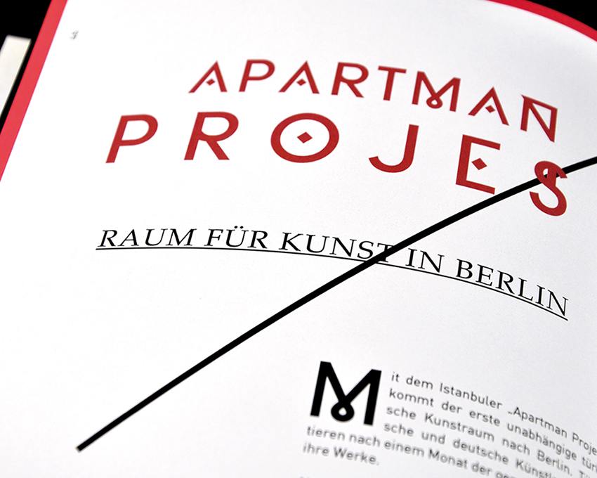
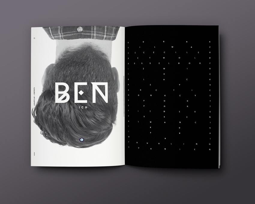
The ornate script in the headline illustrates the fusion of the two cultures. Both the directness of German culture and the playfulness of Turkish culture are reflected by different elements of the ornate script. I decided to include decorative elements in order to emphasize the artistic aspect of the magazine and to break up the overall design a little.
Which patterns refer to German culture and which ones to Turkish culture?
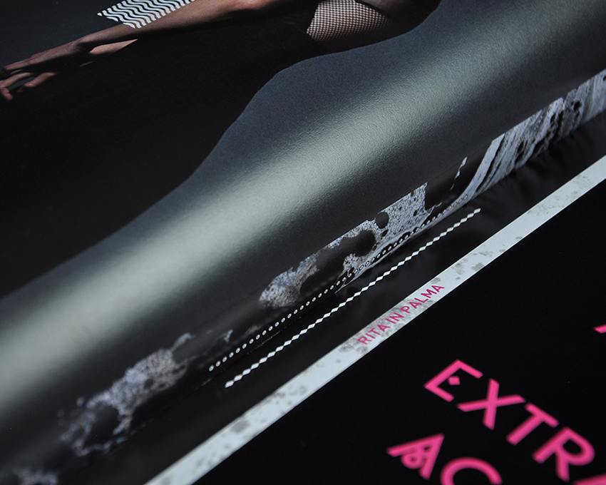
In general, any patterns with lines, waves, spikes and points are intended to illustrate German culture, as they are traditionally found in the German coat of arms. Other design elements are inspired by the Ebru Sanati (traditional Turkish marble art – ed.). Symbols such as stars and crescents represent Turkish culture. Other symbols, such as the Berlin bear decorated with oriental patterns, are intended to represent the fusion of the two cultures. These are just a few of the symbols, there are many more to be found in the magazine.
What is the goal of the project and what’s next?
The aim of the project was to design a magazine that deals with the „Almancılar“, their situation and way of life; and to find an artistic means to address biculturalism. I also wanted to create something new artistically with this magazine. I hope that the magazine will contribute to a new perception of the „Almancılar“ and help to get rid of prejudice.
Credits
Magazine by Burak Yılmaz
